We know accessibility is important, but sometimes it can be difficult to know where to start. Developing accessible content can be daunting; there are several steps to consider when thinking about ways to address the diverse needs of your students. Select topics from the Accessibility Components Menu to learn about the different components of accessibility, examples of who may benefit from increased accessibility and considerations for how to create accessible content.
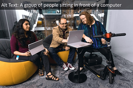
'Alt text' is a contraction of 'alternative text'. It's a short written description of an image, which makes sense of that image when it can't be viewed for some reason.
Who Benefits?
Low Vision | Blind
What Should I Do?
Describe nontext content with alt text (e.g., pictures, graphs, charts).
How Do I Do It?
Learn how to write alt text with these resources:
Example:
Captions are a text version of the speech designed for viewers to understand all essential audio in a video. They are synchronized with the audio and are usually shown in a media player when users turn them on.
Who Benefits?
Deaf/hard of hearing | Blind/Low vision | Users with limited access to high-speed Internet
What Should I Do?
Insert captions for videos and review for accuracy.
How Do I Do It?
Learn how to add captions to your Canvas Studio videos with this resource:
Learn how to add captions to your YouTube videos with these resources:
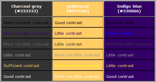
Colors must have sufficient contrast between the text color and the background color.
Who Benefits?
Low vision | Epilepsy | Colorblind
What Should I Do?
- Be mindful of color schemes.
- Use other methods (icons, written content, and other visual elements) besides color to convey meaning.
The purpose of descriptive hyperlinks is to provide users with the proper context of where clicking the link will take them.
Who Benefits?
Low vision | Colorblind
What Should I Do?
- Use hyperlinks to describe the content to which they are linked and the destination.
- Avoid terms such as “click here” or “e-mail.”
- Link text should make sense on its own, without the surrounding paragraph.
How Do I Do It?
- See this example of a descriptive hyperlink: Color Contrast Checker
- If the link goes to a file, add the kind of file as part of the link text: EagleVision Background Slides (PowerPoint)
Font and typefaces are the foundation of accessible visual reading experiences. It needs to have a certain level of legibility (including height, width, and thickness) and readability.
Who Benefits?
Cognitive delays | Learning disabilities
What Should I Do?
- Use accessible font styles (sans-serif) and sizes (nothing less than 12-point font).
- Use manageable sections or chunks of text.
- Use short sentences that are not unnecessarily complex.
How Do I Do It?
- Learn about accessible font styles.
Software accessibility offers content that can be easily consumed and operated by anyone.
Who Benefits?
Physical limitations (e.g., Cerebral Palsy) | Low vision | Blind
What Should I Do?
- Use your software’s built-in styles and automatic features (e.g., headers, table of contents, bullet points/numbering, format painter, margins, tables).
- Avoid the tab key and space bar; they do not create an accessible structure.
- Ensure navigation through a keyboard for users unable to operate a mouse.
How Do I Do It?
- Use this Canvas Accessibility Checker to learn how to use the Rich Content Editor's built-in Accessibility Checker in your Canvas courses.
- Use this Microsoft resource for Word documents to learn how to make the most of built-in styles and features for Word documents.
- Use this Microsoft resource for PDF to learn how to make the most of built-in styles and features for PDF files.
For additional support contact RCTLE: rctle@erau.edu